ShopDreamUp AI ArtDreamUp
Deviation Actions


Description
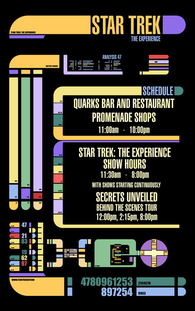
I'm working on the sign for the front of the Star Trek experience, but I want to know what you guys think before I give it to them.
Star Trek panels are all horizontal, but corporate wants a vertical sign. That in itself makes this feel wonky to me... Do the showtimes catch your eye? Should they be a different color to make them pop?
UPDATE:
Lightened the showtimes text and changed that color to a light yellow
Changed the bars color on the left to emphasize the yellow of the text
Made the blue "experience" smaller to fit with the bottom part of the TREK text
UPDATE 2:
Added some red
Made the targeting display cross bigger
Warmed up the colors somewhat
Slimmed down the bar with the analysis 47 on it and added the bars to the right
Update 3:
Found a near perfect LCARS font.") Changed the major ones to the better font
Changed the major ones to the better font 
Star Trek panels are all horizontal, but corporate wants a vertical sign. That in itself makes this feel wonky to me... Do the showtimes catch your eye? Should they be a different color to make them pop?
UPDATE:
Lightened the showtimes text and changed that color to a light yellow
Changed the bars color on the left to emphasize the yellow of the text
Made the blue "experience" smaller to fit with the bottom part of the TREK text
UPDATE 2:
Added some red
Made the targeting display cross bigger
Warmed up the colors somewhat
Slimmed down the bar with the analysis 47 on it and added the bars to the right
Update 3:
Found a near perfect LCARS font.
Image size
627x1000px 119.11 KB
© 2005 - 2024 renonevada
Comments15
Join the community to add your comment. Already a deviant? Log In
AWESOME